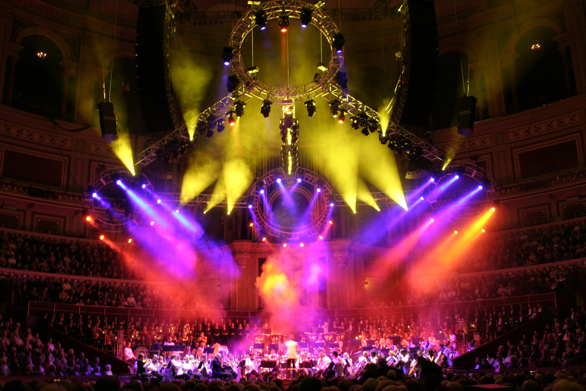
Stepping away from the technical to embrace the creative side of things, let us get back to basics about how we communicate with colour in the live events industry. What influences our colour choices and how do we communicate emotions and be esthetically pleasing? Every event has a theme and there is the intent behind that theme. The colours we choose as lighting designers not only light the show but share a message that the show wants to convey.
We are likely to approach colour from the lens of our cultural background. Each culture will have its own emphasis on colour associations and how to communicate using these. For many years, patriotic messages have been conveyed by using the colours in country flags and continue to be done as an act of solidarity. Colour association is achieved by knowing the emotion behind it, and great show energy is derived from the colour of lighting choices. Within all cultures, there are broad and specific meanings that are communicated.
Let’s examine the emotions and themes conveyed by colour:
- Red: love, danger, anger, passion, blood
- Orange: warmth, fire, energy, playfulness
- Yellow: wealth, happiness, optimism, sunshine, joy, caution
- Green: money, luck, jealousy, greed, nature, flora, spring
- Cyan: calm, balanced, cleanliness
- Blue: calmness, trust, high tech, futuristic
- Purple: royalty, luxury, nobility, magic
- Magenta: spirituality, femininity, children
- White: purity, peace, medicine, elegance, but these are also dependent on colour temperature
When we have a project to work on, understanding these basic colour associations, it is important we think ahead and ask questions before programming. We want the audience to feel something with each passing lighting cue and to do this, we need to examine the story being told by the show.
- What do we want the audience to feel?
- What is the content? What feeling or concept is the artist or show trying to convey, and how are they going about that?
- What do we want people to feel, not only in the entire show but also at specific moments during the show?
- Do the colours for each part / segment fit into a larger conceptual framework within the show itself, and if so, how?
If the show is broken up into segments or song by song, scene by scene, there will be an aesthetic mix of colours to match the desired audience emotion for each part of the show. Knowing which colours to combine is a generous mix of understanding the principles of light, how colours work together (or against each other), the foundation of complementary colours while applying known colour associations and of course, hands-on experience.
Most lighting designers learn the colour wheel early on in their education or career. Once you understand how primary colours work, you can mix and match the right colour choice. Complementary colours are two colours that work well with each other. Although more difficult, you can use three assorted colours in a scene.
Common examples of complementary colours are:
- Red/Green
- Blue/Yellow
- Amber/Magenta
- Cyan/Amber
- Red/Green/Blue
- Cyan/Magenta/Yellow
You can predict that the colours that create a triangle on the colour wheel will work well together. Red, green, and blue are considered the primary additive colours of light. This means you can add them together to create other colours:
- Red + Green = Yellow
- Red + Blue = Magenta
- Green + Blue = Cyan
- Red + Green + Blue = White
Mixing coloured light creatively, balanced and emotively is an art.
Getting to know mixing combinations comes instinctually and intuitively over time and colour dominance is something to be aware of as our vision might not turn into the reality we expect if we don’t account for how colours react and fold into one another.
- Secondary colours tend to dominate primary colours.
- Unsaturated colours dominate saturated colours.
- Warm colours will dominate cool colours.
A simple Google search offers a list of considerations for colour dominance.
A helpful thing to note:
The one thing any lighting designer wants to remember is to keep the lights moving and colours changing. When our eyes see the same colour for extended periods of time, we desaturate what we are seeing. This is called “colour fatigue” and something we want to avoid when preplanning.
To understand more about “colour fatigue”, otherwise known as retinal fatigue, and see its effects firsthand, the School of Physics in Sydney, Australia has published some online examples you can try at home.
The best kind of lighting design incorporates a balance of movement, strobes, and lighting changes, helping to tell the story and/or create a grand experience. Also, to consider, the pace, mood, rhythm, or simply what’s intended to be highlighted, at that moment.
There are moments for the light show, moments for the performers, and moments where the light just does its job.
All senses ignite when an audience is immersed in the live show. Lighting designers hold the key to buildups, the climax, and cooldowns. Getting an emotional message across is the lighting designer’s mission on the stages they light, making a memorable impact.
These are the canvasses we paint, and audience reaction is what we thrive on.
How have you been working with colour? Have you been involved in projects where you have worked with a branded colour scheme? An event that has a patriotic message? How have you used colour to inspire? Let us see the emotions you convey using light. Send us your work to marketing@cast-soft.com and explain how you were able to #communicateincolour using WYSIWYG.